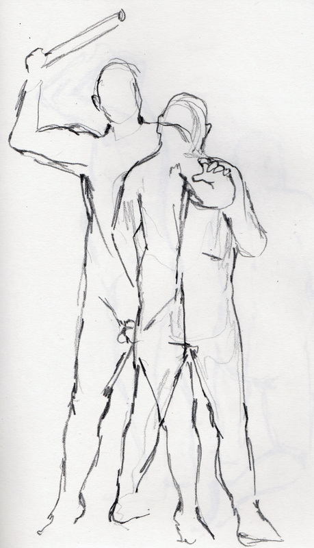
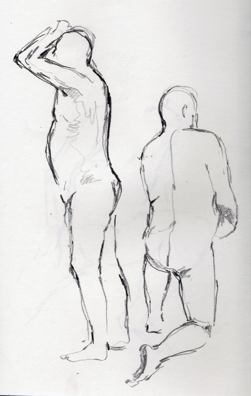
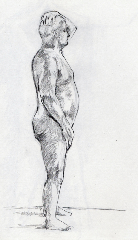
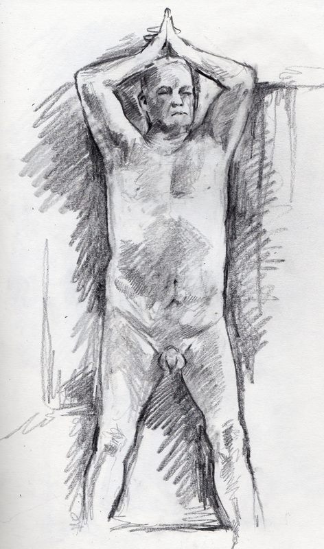
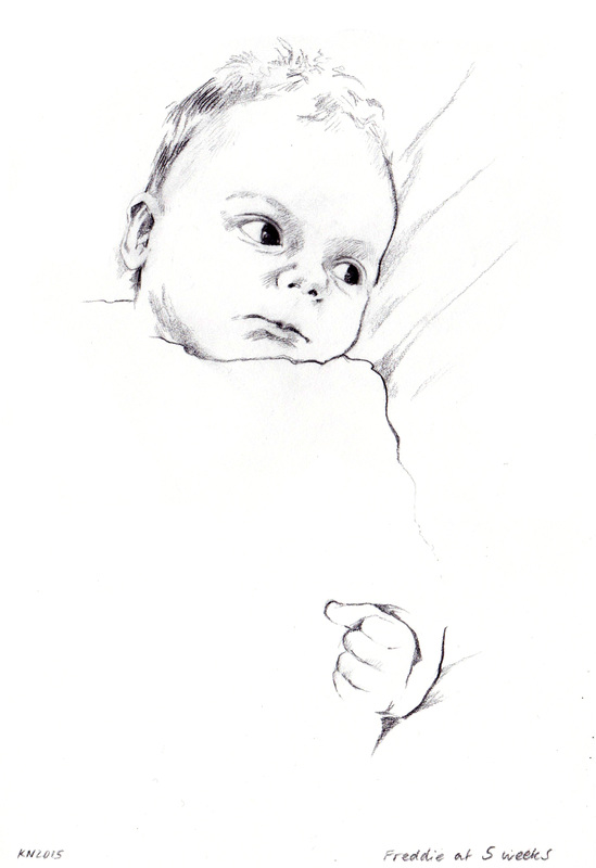
All drawings in 4B/5B pencil and graphite stick. Click to enlarge and see sketching times.
|
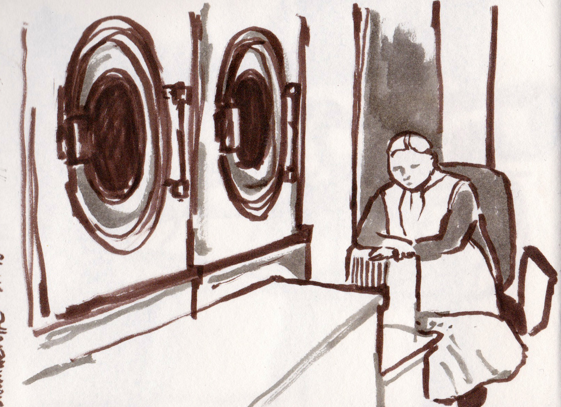
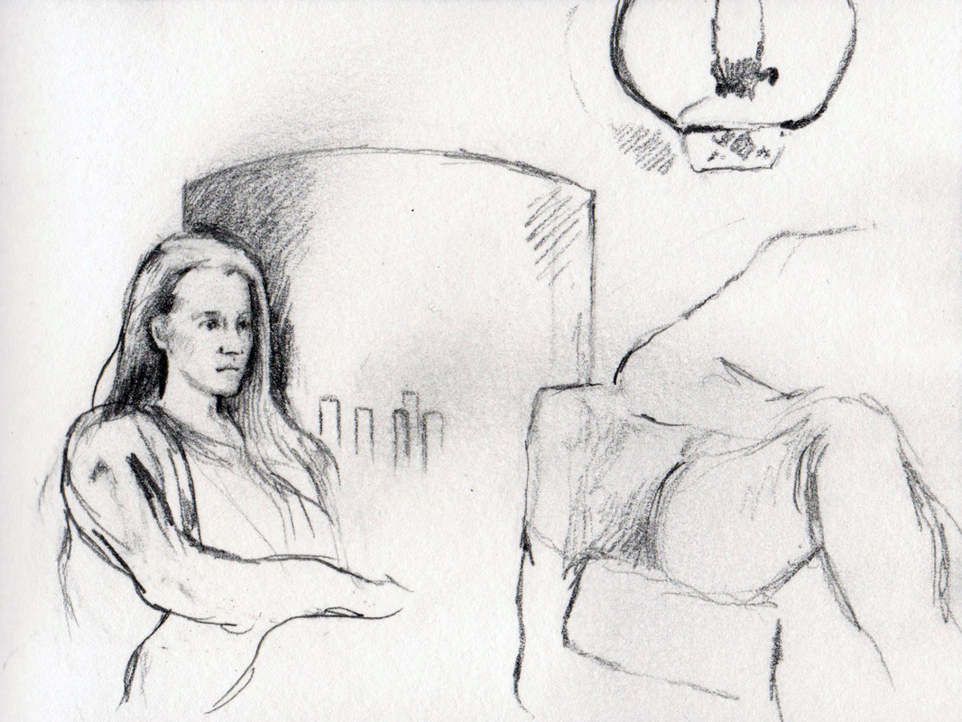
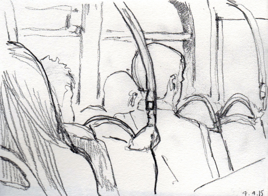
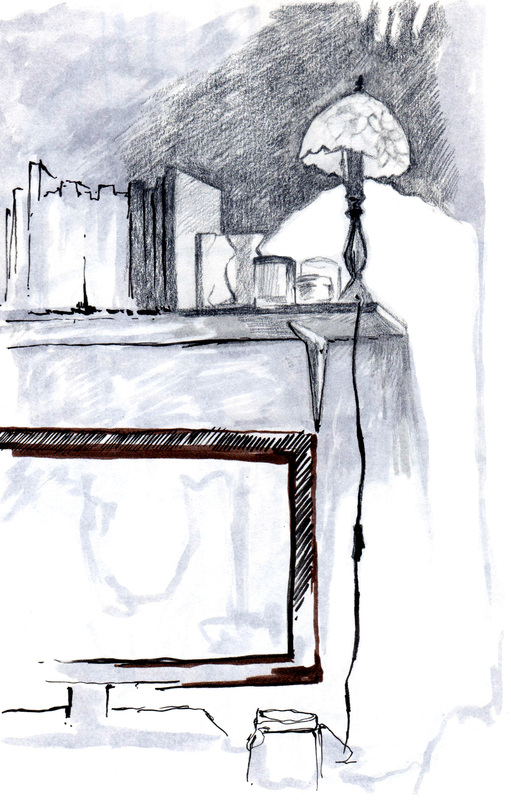
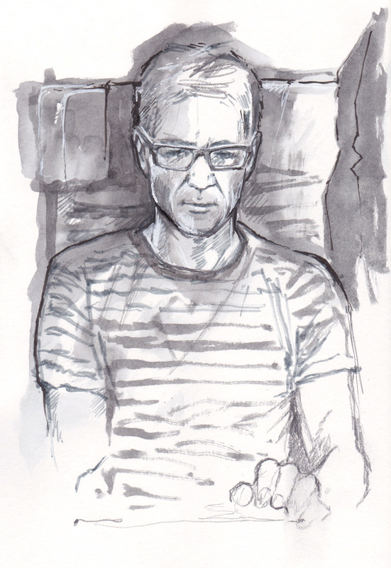
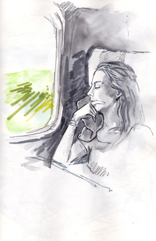
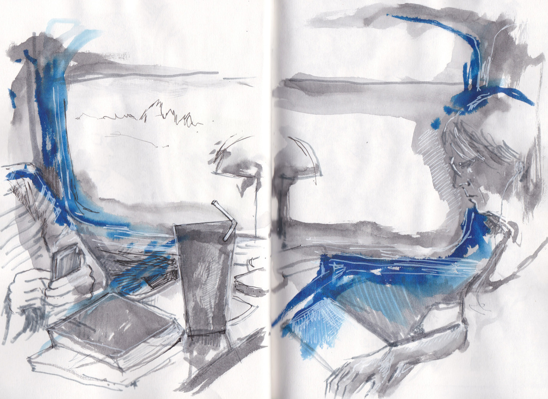
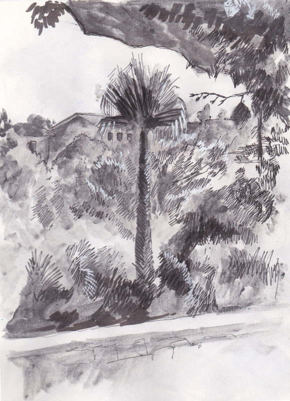
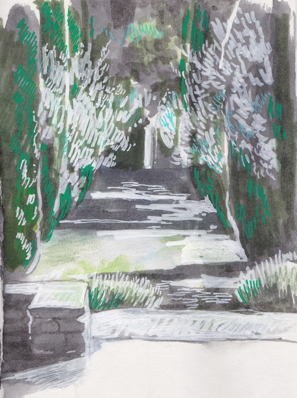
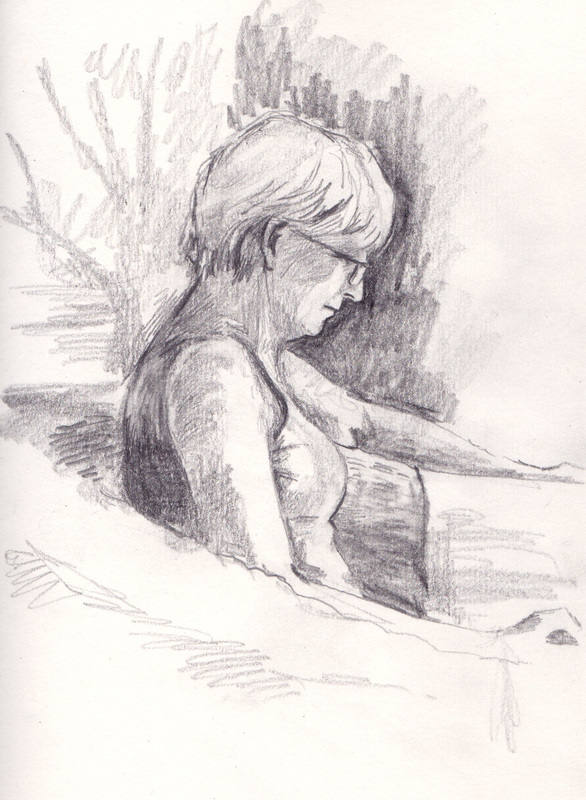
I drew a 'Thank You' piece for The Forgiveness Project this week - I've been working with them for 2 years now and they've been great. I sketched the text by hand, then used my new lightbox (mmm) to ink it directly onto a fresh page. 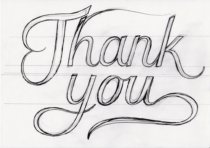 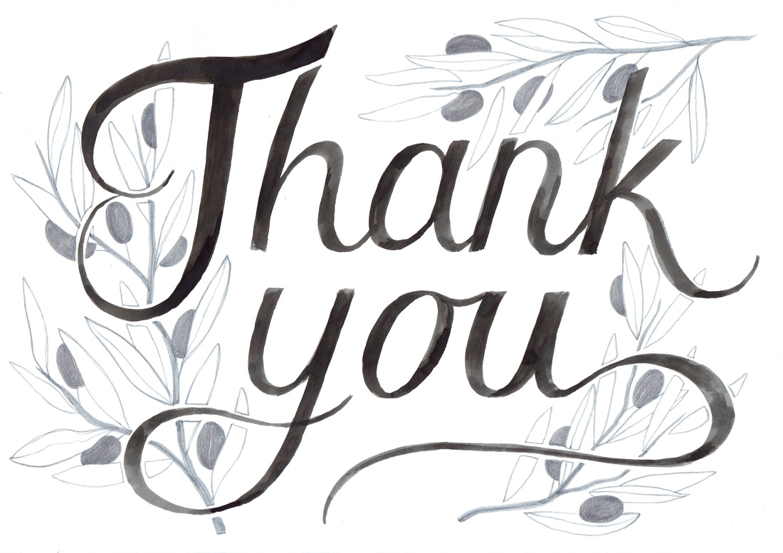 I've been trying to use my sketchbook more this year when I'm out and about. Here are the results (click to view): I had a few days in France last week with my parents - was a great chance to do some sketching, partly because my dad (James Nairne) brought lots of really nice pens that I was able to use (thanks pa). I really need to be more active in my sketchbook and less precious about it - it keeps me drawing more regularly and builds my confidence with experimentation. Here's my sketchbook pages from the trip (click to see full size and scroll through images): The bottom left sketch was my first experience using liquid pencil - pretty weird stuff. Easy to move around but quite a strange texture, not sure how I felt about it but interesting to try.
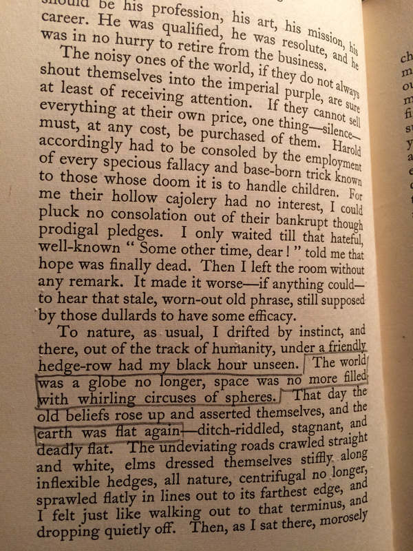
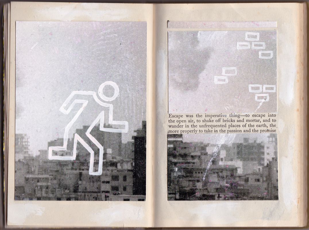
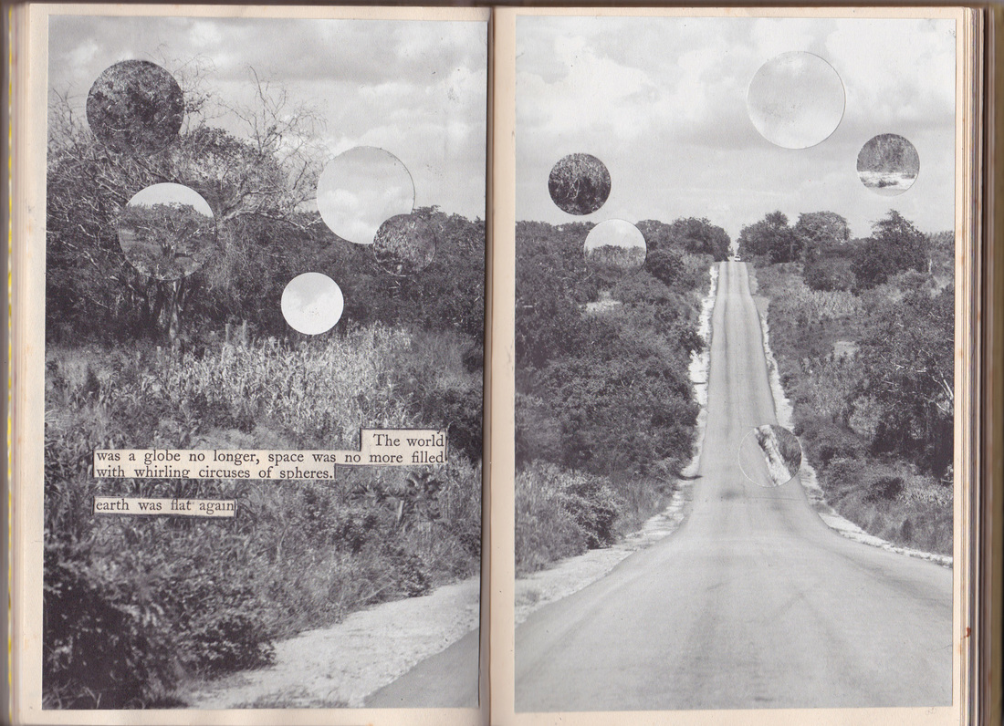
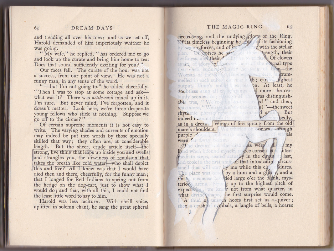
Doug and Olivia asked me to put together a design for their wedding that could be used on service sheets and the table plan - they weren't too rigid with their guidelines but did want it to include their pet tortoise, Frank, if possible...! I drew a series of draft designs for them to choose from (see below) and then developed their chosen design into a final emblem in watercolour. 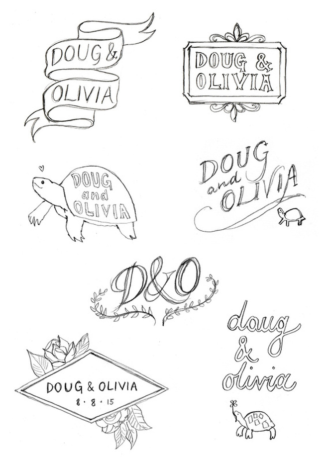 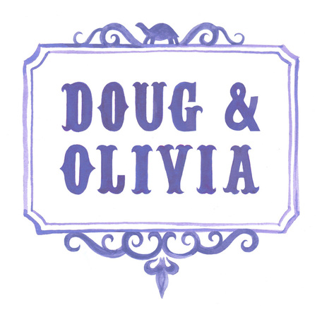 I've been working for a while now on an altered book project with talented friends Hannah Hunter-Kelm (illustrator/printmaker) and Ella Dickinson (photographer) - click here to see previous blog posts. I thought I might use this blog post to show my process as I worked on my latest contribution to the project. The book we've been working into is the lovely Dream Days by Kenneth Grahame, illustrated by E H Shepard - it lends itself well to the project as the narrative contains many interesting phrases that inspire a visual response, and Shepard's silhouette illustrations can be incorporated into our own contributions or add to the overall feel of the artwork. I've been using a lot of collage during this project - I love collage and don't get the opportunity to use it that often in commissions so I've been taking this as an opportunity to do so. It has also been interesting to work with Hannah and Ella as artists who have very different approaches. Part of the challenge for me has been to think forward to what they might add to the pages and part of the enjoyment has been to see how they interpret the project. Hannah's style is much more colourful and playful than mine (I tend to use black and white or limited colour palettes), and she experiments more. Ella uses her photography to complement the text, and draws out social justice and current event themes that add a new dimension to the book. I try and keep this in mind as I work on the book and prepare pages for them. Click images above to see in full. Left: An interesting phrase had been left framed by some striped paper - I removed the paper as I thought I'd like to put something surrounding the phrase that fitted more with the text. Right: I usually then go through the next few pages and highlight any particular phrases that I find interesting. I was pretty sure I had some collage images that showed destruction after a tornado - the phrases I'd been looking at conjured up ideas of rubble and dust. I also found a black and white image (from a leaflet I picked up at the Wellcome Collection) of a flat landscape that I thought would work for the following page, and complimented the other collage pieces in terms of colour and texture. The image with the mushroom cloud is by Walid Raad. 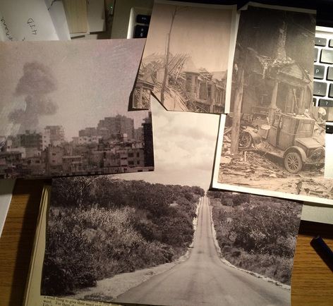 For the 'escape' page - I decided the mushroom cloud picture would work best as it would split well across the double page spread. 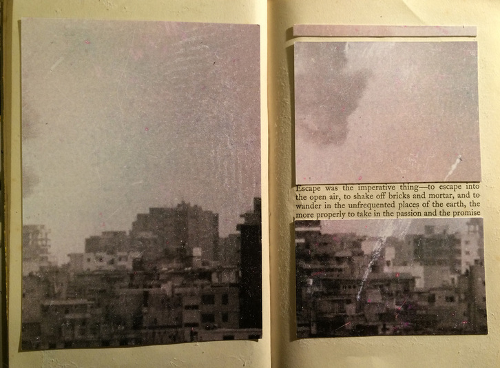 I decided to work into it more - mostly because I wanted to make the page 'mine' rather than just the work of another artist.  The next page included some text about the heart sinking and losing hope. Melancholy themes also seem to allow for more visually interesting ideas, and work with my style of art, and seem to recur in my work. I picked out those phrases and set out to represent them visually in paint: 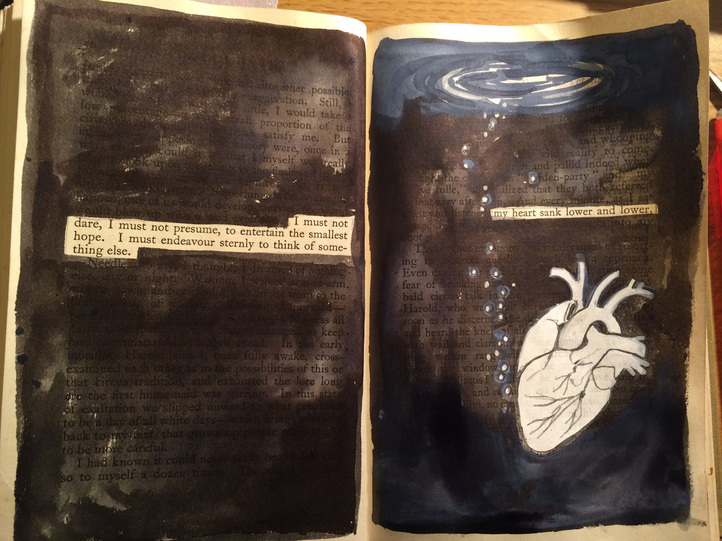 Above: work in progress using my favourite materials - white gouache, ink and pencil. 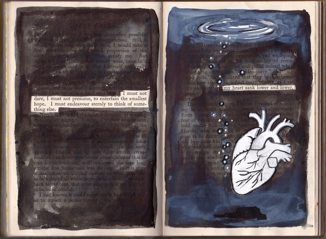 Above: final page spread. I added in some black lines with a brush pen and worked into the background a bit more. I also completed a few more spreads that you can see in the gallery below. Click to see the full images and scroll through them. I left the last couple fairly minimal as I thought that Hannah and Ella might see some ways to work into them further. There are no real rules in this project - we all seek to respect each other's work but we can work into pages that another has done, so it will be interesting to see where they add more. Hope this was an interesting insight into one aspect of my work - let me know if you'd like to see more posts like this!
I've been working as Curatorial Project Co-ordinator for an exhibition at House of Illustration called 'Pushing the Envelope' (click link to learn more), and cheekily have submitted my own envelope artwork to be displayed alongside the illustrators we've asked to participate. I know I'm biased, but have a look at the House of Illustration website or follow them on twitter as it is a fantastic place with really fun exhibitions. 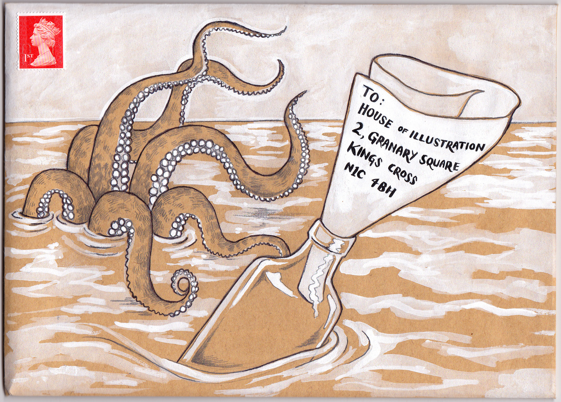 (pencil, pen, gouache on brown paper envelope)
I've been working on this painting over the last few evenings - it is based on lyrics from the song 'Farewell Appalachia' by Stornoway (a fantastic band if you don't know them already). I now wish I'd put more time and thought into the composition because I like to think a really fantastic painting could convince one of the members of Stornoway to marry me and/or commission me to illustrate their next album cover. Hey, maybe next time eh? 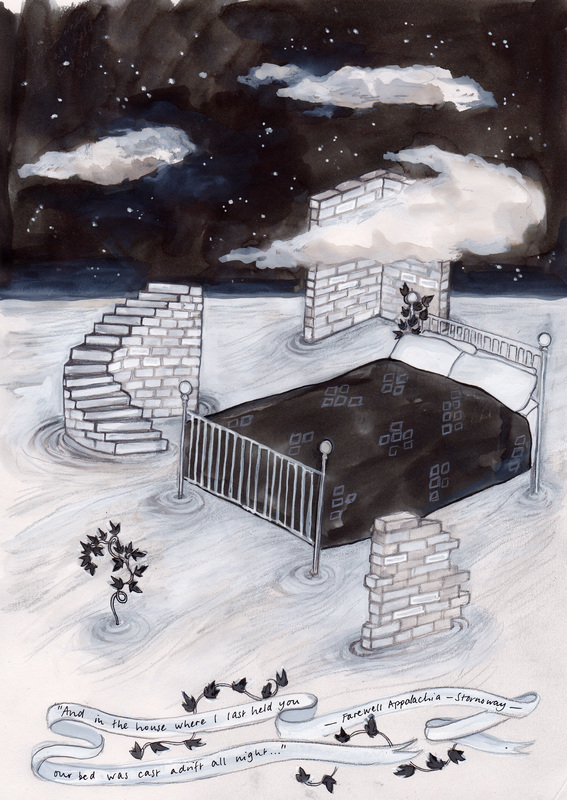 Ink, gouache, watercolour pencil, graphite pencil, pen.
|
Katie McCurrachKeep up to date with my most recent projects. Archives
May 2019
Categories
All
|


 RSS Feed
