|
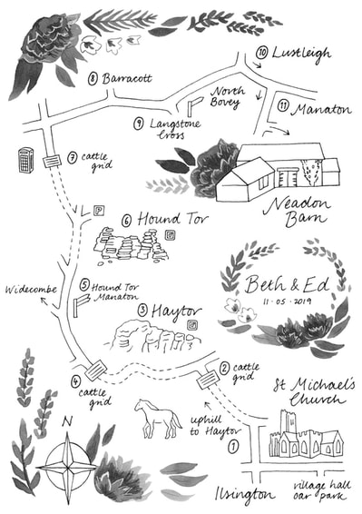
I was commissioned to design a map for Beth and Ed to help their guests get from the church to the reception venue. I enjoyed the challenge of creating something that tied in with their existing stationery design and flower choices, but was also practical and easy to follow.
0 Comments
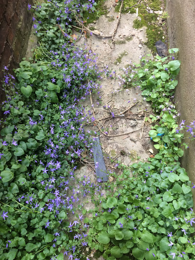
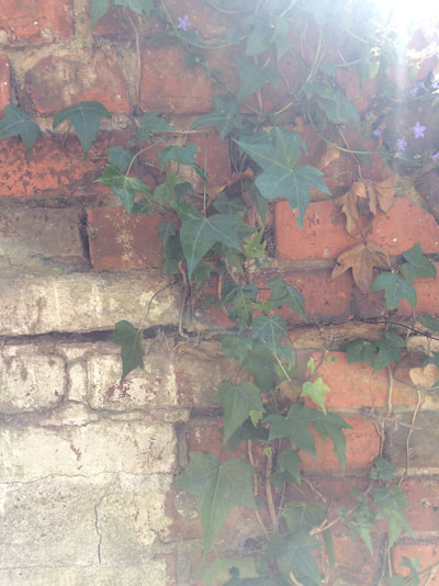
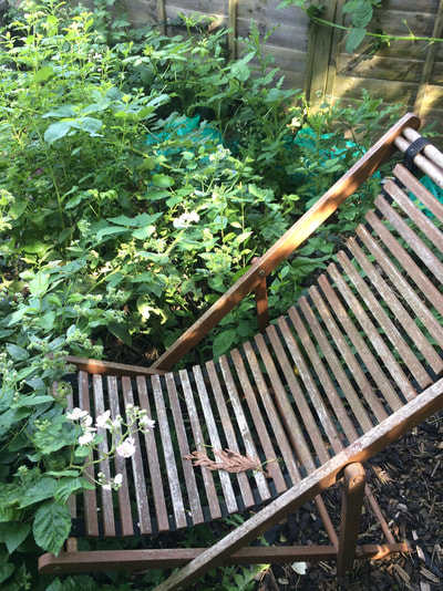
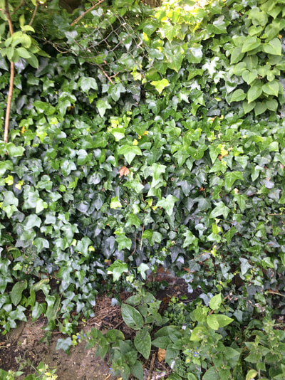
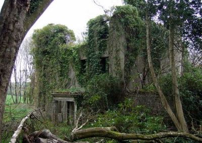
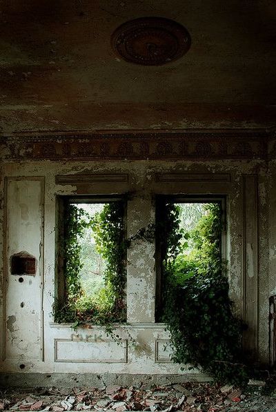
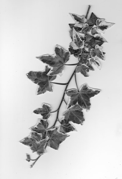
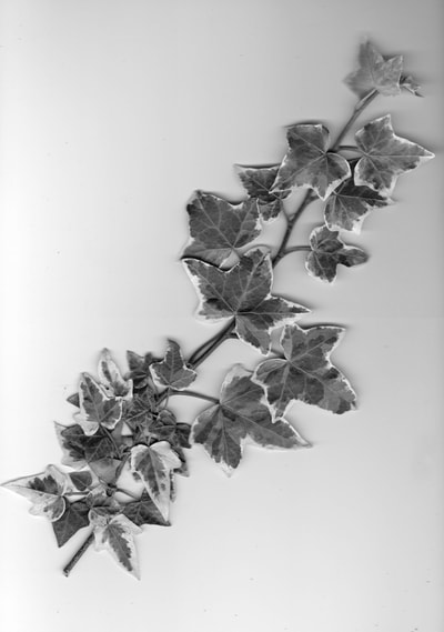
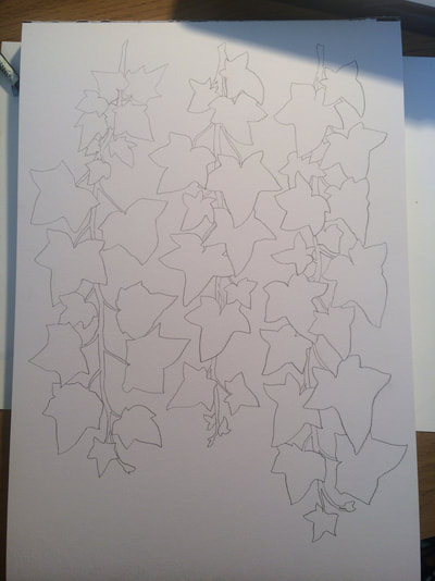
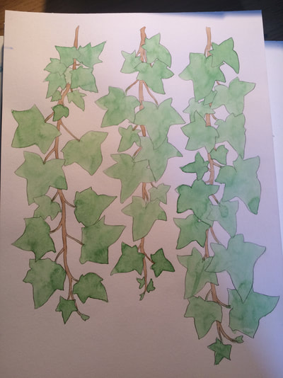
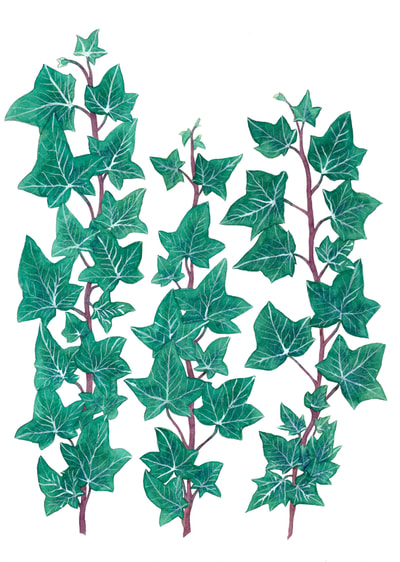
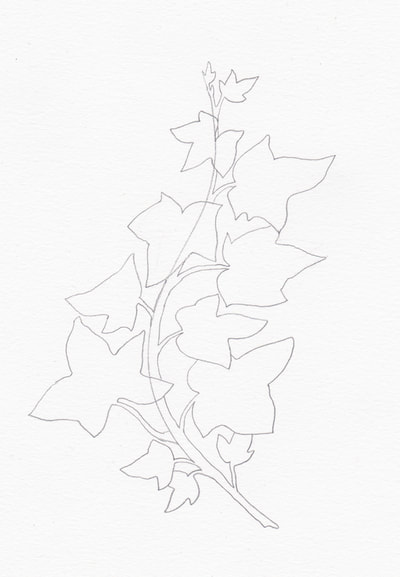
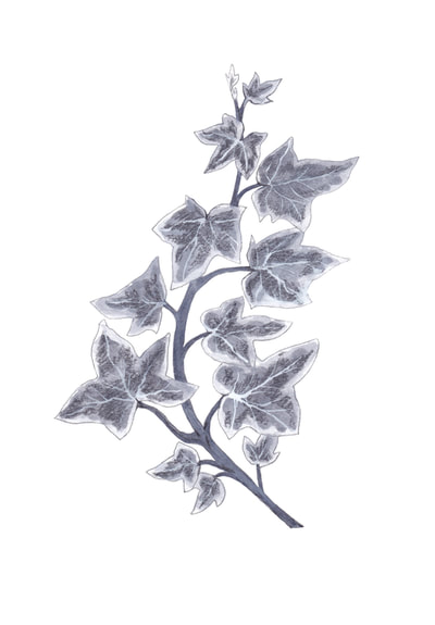
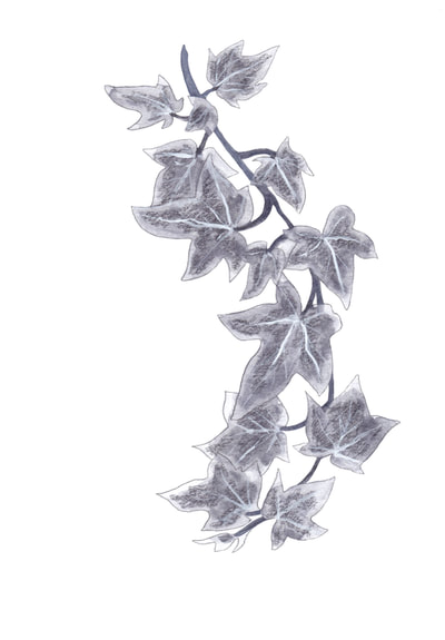
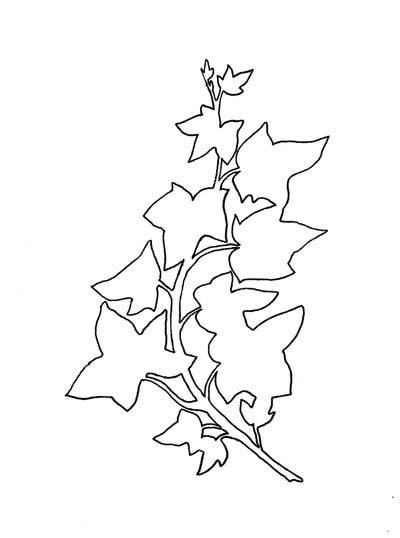
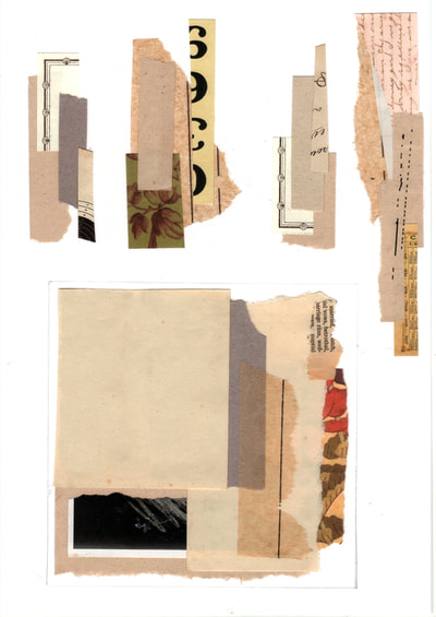
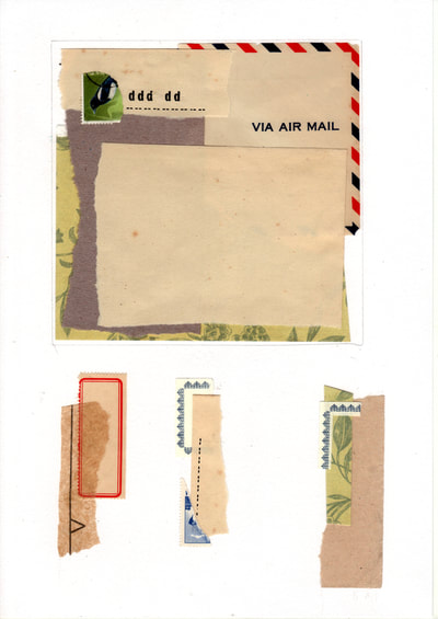
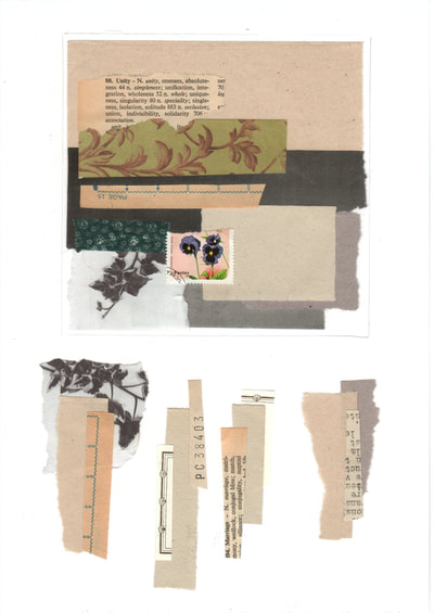
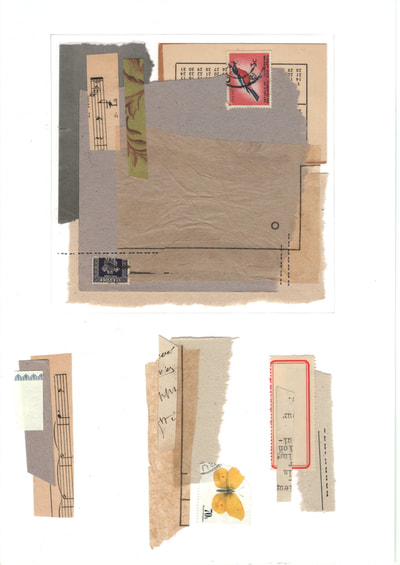
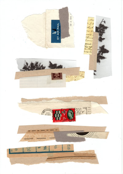
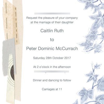
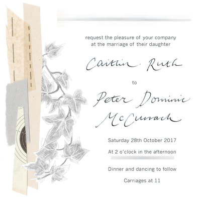
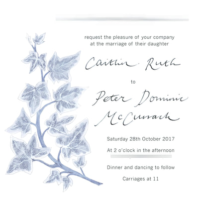
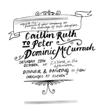
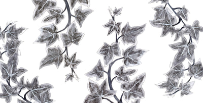
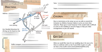
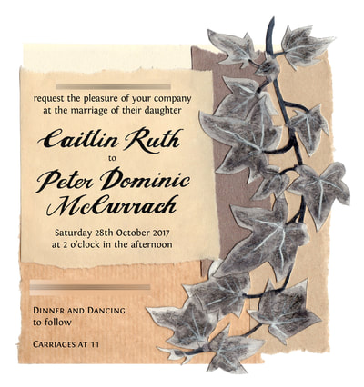
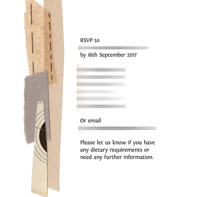
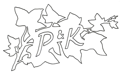
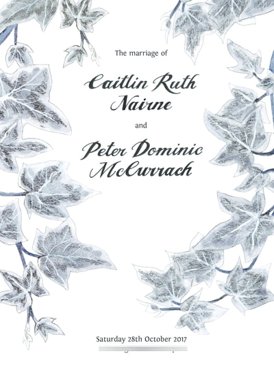
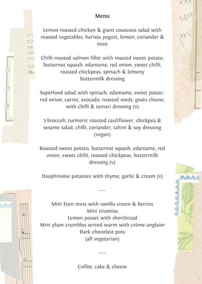
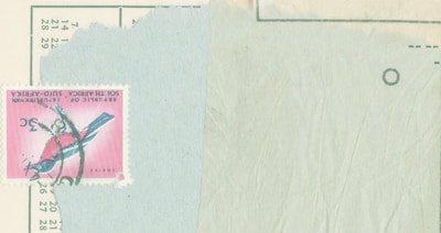
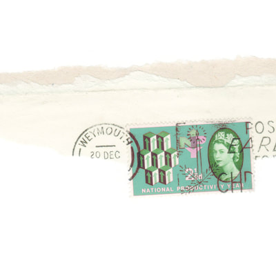
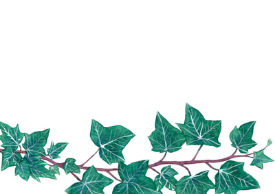
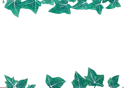
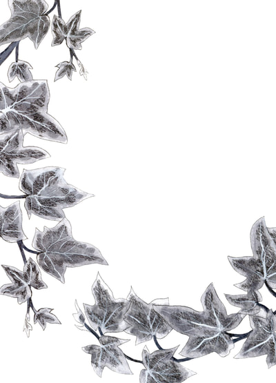
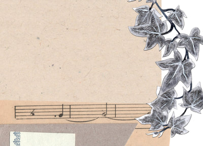
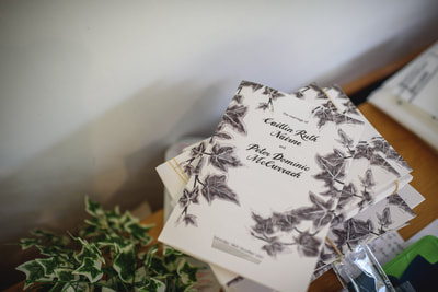
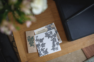
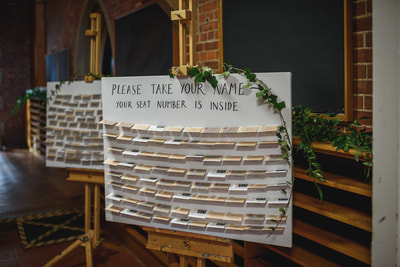
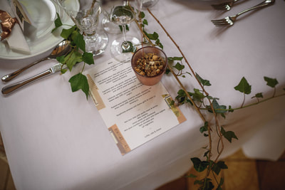
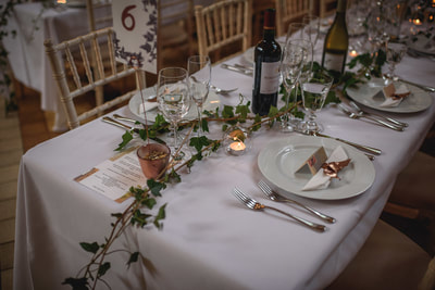
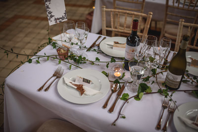
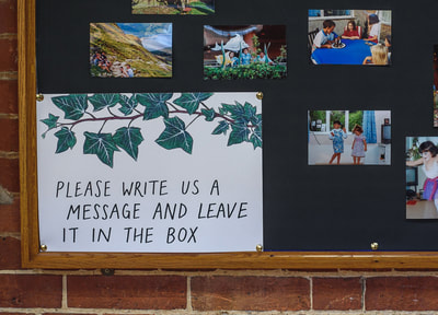
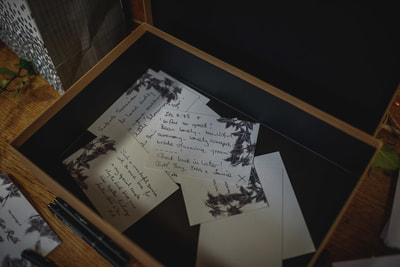
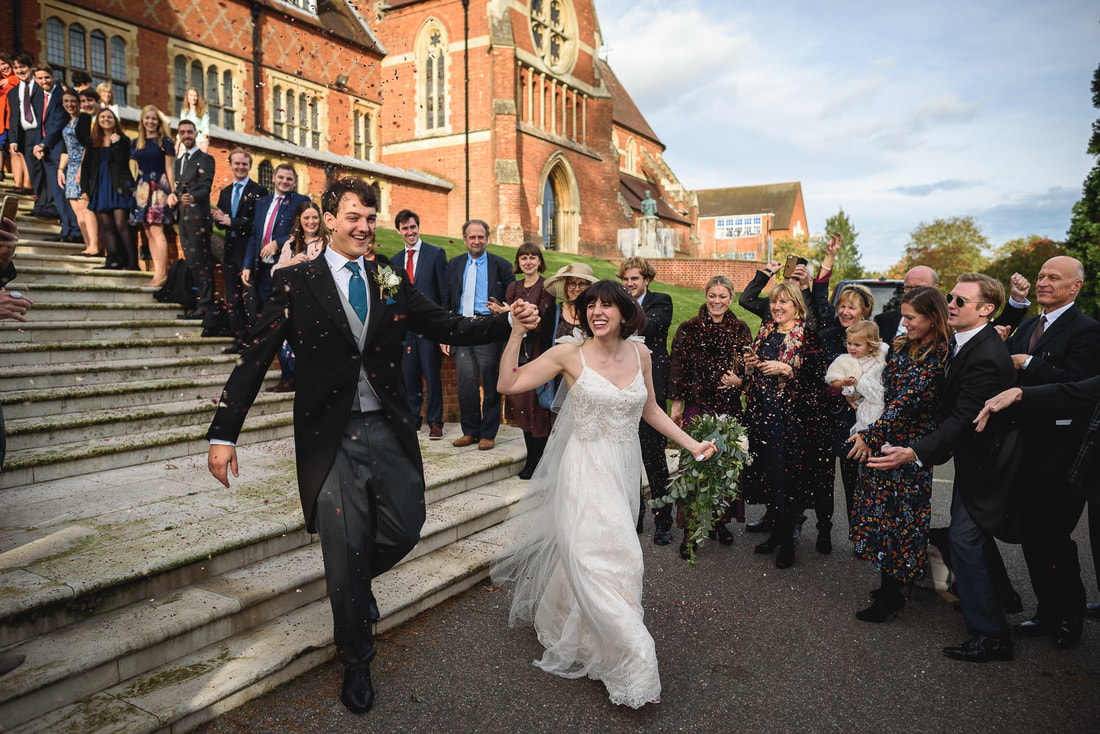
I've been quiet on here for a while - mostly because my creative energy has gone into planning my own wedding back in October. I designed all of the stationery from invitations to service sheet to place settings - see below. Inspiration came from our overgrown back garden, pictures of ivy covered buildings, and various collage artists that I've always liked - Rauschenberg, Joseph Cornell, etc. 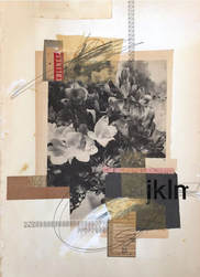 I was also inspired by a series of collages by Lee McKenna (left) as I thought they combined foliage with ephemera well. I scanned in some ivy leaves (see below) to collage but then thought it would be a shame not to draw them myself so did some paintings of ivy in colour and black and white, that I then used throughout the wedding stationery. I made several pages of mini collages that I was then able to select from and combine with the ivy for other sections of stationery. These required a lot of touching up and minor colour edits until I was happy with them. There was also a long process of experimenting before I was happy with how to combine the collage and ivy sections with text. In the end I used a font called 'Angel Tears' (yep...) as the basis for the calligraphy text, but traced it myself so I could make some of the letters look better. The plain serif font used was 'Fontin'. I drew a map for the inside of the invitation, and also one of the inside of the reception venue for the service sheet. I also designed envelope liners but we never used them (stationery madness). I've blurred personal details but hope you get an idea from the images below - click to see full images and captions. Here are some pictures of the final designs in situ (photos by Guy Collier Photography): It's left a bit of a vacuum in my creative life now it's over but I'm looking forward to starting some new projects and getting back to commissions.
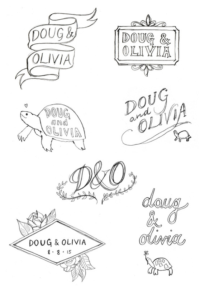
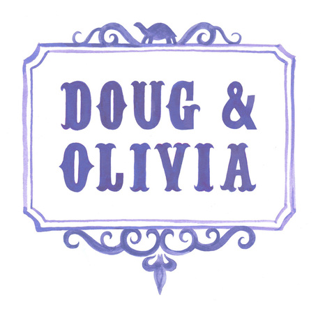
Doug and Olivia asked me to put together a design for their wedding that could be used on service sheets and the table plan - they weren't too rigid with their guidelines but did want it to include their pet tortoise, Frank, if possible...! I drew a series of draft designs for them to choose from (see below) and then developed their chosen design into a final emblem in watercolour.
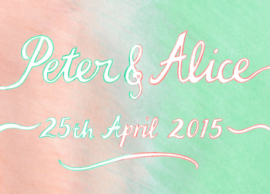
I was commissioned by Alice and Peter to draw some handwritten text in mint and coral for their wedding invitation - the final result is below: There were a couple of alternatives that I gave them to choose from (I originally drew them in a more blue shade, this was adjusted digitally later to fit the couple's colour scheme more closely). Click to view larger:
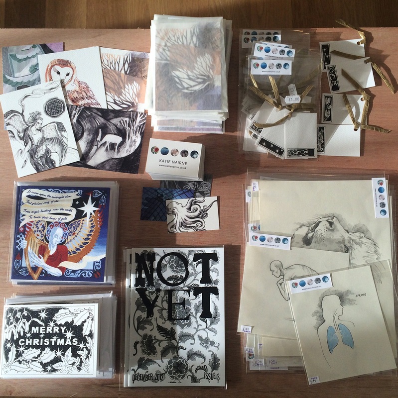
The House of Illustration Christmas Illustrators' Fair is on until 7th December and I'm selling packs of postcards, 2 card designs for Christmas, gift tags and some original drawings:
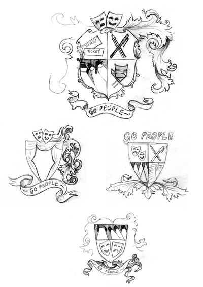
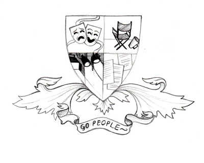
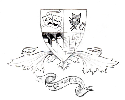
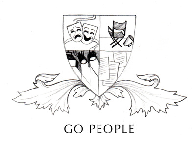
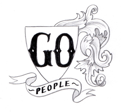
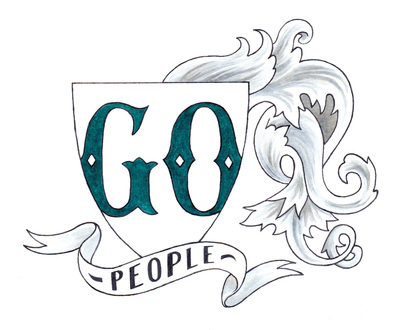
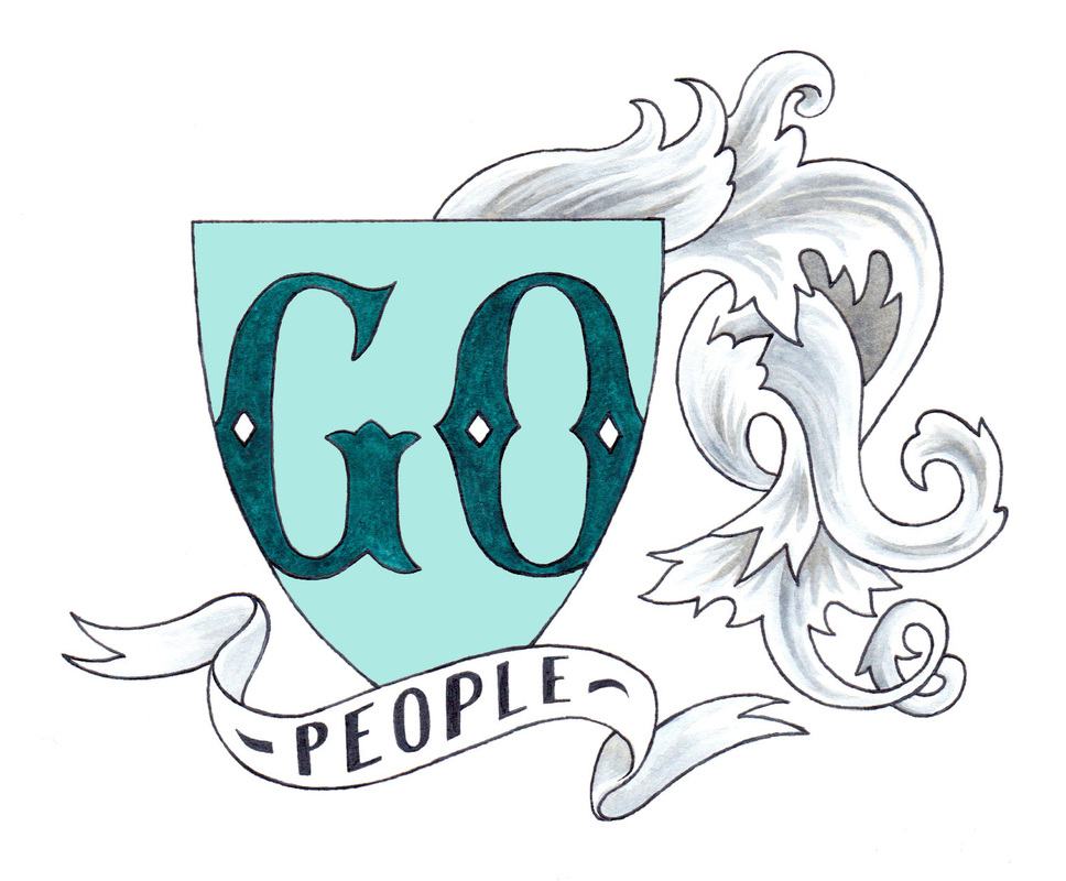
I've been working on a logo design for new theatre company Go People - click on images below to see the design process.
|
Katie McCurrachKeep up to date with my most recent projects. Archives
May 2019
Categories
All
|
|
|


 RSS Feed
